

Interior design planning mistakes are defined as decisions made without integrated consideration of scale, lighting, traffic flow, and spatial hierarchy, producing rooms that look wrong and feel worse to live in. The most costly errors happen before a single piece of furniture is purchased. Skipping the planning fundamentals leads to disjointed spaces, budget overruns, and rooms that never quite work. Tools like Thecozyedit now let homeowners visualize full redesigns before committing to purchases, which removes much of the guesswork that drives these errors. Understanding where planning breaks down, and why, is the fastest way to get a room right the first time.
1. Common interior design planning mistakes start with mood boards
Mood boards are useful for gathering inspiration, but they are not a design plan. Nearly 50% of homeowners who rely exclusively on mood boards report dissatisfaction with their finished rooms within 12 months. That number reflects a structural problem: mood boards optimize for how things look in isolation, not how they perform together in a real room with real light and real dimensions.
The fix is to build your room from the inside out. Define the room's primary function first. A living room used for movie nights needs different furniture groupings, lighting, and traffic flow than one used primarily for conversation. Document how you actually use the space before selecting a single item.
Pro Tip: Try the three-day observation method. Spend three days noting where natural light falls at different times, where you naturally walk, and where clutter accumulates. This reveals friction points that no mood board will ever show you.
- Write down every activity that happens in the room
- Note where natural light enters and at what times of day
- Identify the paths you walk most frequently
- Mark where items tend to pile up, since that signals a storage or layout gap
2. Choosing furniture that is the wrong scale for the room
Scale is the most frequently misjudged variable in residential design. Furniture that is too large crowds a room and blocks natural movement paths. Furniture that is too small makes a room feel sparse and unfinished, regardless of how well chosen each individual piece is.
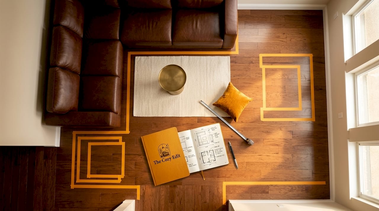
Undersized rugs are the single most common scale error designers notice when they walk into a home. A rug that does not extend under the front legs of all major seating pieces fails to anchor the furniture group, making the arrangement feel disjointed. The rule is simple: when in doubt, go larger.
| Furniture mistake | What it causes | Correction |
|---|---|---|
| Rug too small | Furniture floats, space feels unanchored | Extend rug under front legs of all seating |
| Sofa too large | Blocks traffic flow, crowds the room | Measure clearance paths before purchasing |
| Coffee table too low | Uncomfortable reach, poor proportion | Table height should match sofa cushion height |
| Artwork hung too high | Neck strain, visual disconnect from furniture | Hang at 57 to 60 inches from floor to center |
Pro Tip: Tape out furniture dimensions on the floor with painter's tape before you buy anything. Walking around the taped outline for a few days tells you more about scale and flow than any floor plan drawing.
3. Pushing all furniture against the walls
Placing every piece of furniture flush against the walls is one of the most persistent interior layout mistakes in residential spaces. The instinct makes sense: it feels like it opens up the center of the room. The result is the opposite. Furniture pushed against walls creates cold, uninviting empty centers that drain warmth from a space.
Floating furniture groupings in the center of a room creates intimacy and defines zones within open-plan spaces. A sofa pulled 18 inches from the wall, with a console table behind it, immediately makes a room feel more intentional and livable. The empty space between furniture and wall becomes a secondary circulation path, which actually improves flow rather than restricting it.
The principle behind this is called furniture islands. Each island serves a defined purpose: conversation, reading, dining, or work. Rooms with clearly defined islands feel larger and more functional than rooms where furniture lines the perimeter.
4. Treating lighting as an afterthought
Lighting is the most technically demanding element of interior design, and it is the one most often addressed last. Lighting should be planned third, after layout and visual hierarchy are established, so that it complements and reinforces the decisions already made. Planning it first or last produces the same problem: lighting that fights the room instead of supporting it.
Relying on a single overhead light source is the most common lighting error in residential spaces. A single overhead fixture washes out surfaces, flattens textures, and creates harsh shadows that make rooms feel institutional rather than lived-in.
The correct approach uses three layers:
- Ambient lighting provides overall illumination and sets the room's base brightness level
- Task lighting targets specific work areas like reading chairs, kitchen counters, and desk surfaces
- Accent lighting highlights architectural features, artwork, or objects to create visual depth
"Layered lighting is what separates a room that photographs well from a room that actually feels good to be in. One overhead light is never enough." — House Beautiful design editors
Color temperature consistency matters as much as fixture placement. Consistent bulb temperature in the 2700K to 3000K warm range for living spaces creates visual coherence across a room. Mixing warm and cool bulbs in the same space creates subtle discomfort that most people notice but cannot identify.
5. Ignoring spatial hierarchy and focal points
Every room needs a dominant element, a supporting element, and accent layers. Without this hierarchy, the eye has nowhere to rest, and the space feels visually exhausting even when every individual piece is attractive. This is one of the most overlooked interior design pitfalls in DIY projects.
The 60/30/10 rule provides a reliable framework. Sixty percent of the room's visual weight goes to the dominant element, such as a fireplace, a large sofa, or a statement wall. Thirty percent goes to supporting elements like secondary seating or a media console. Ten percent goes to accents: throw pillows, artwork, and plants.
- Identify the room's natural focal point before placing any furniture
- If no focal point exists, create one with a large piece of artwork, a bold paint color on one wall, or a statement light fixture
- Arrange all other furniture to face or acknowledge the focal point
- Avoid treating every wall and surface as equally important, since this flattens the room visually
Rooms without a clear focal point feel unresolved. Visitors cannot tell where to look or where to sit, which creates low-level discomfort that undermines the entire design.
6. Selecting materials and finishes without a coordinated plan
Material selection errors are among the most expensive planning errors in decor because they are difficult to reverse. Paint colors look different under artificial light than they do on a sample card. Tile grout colors shift under warm versus cool bulbs. Wood tones that match in a showroom can clash under the specific light conditions of your home.
Treating interior planning as decoration rather than an integrated phase of construction causes misplaced electrical outlets, blocked windows, and lighting fixtures that cannot be repositioned without significant rework. These are not aesthetic problems. They are functional failures that cost money to fix.
Pro Tip: Always test paint samples and material swatches under the actual lighting conditions of the room, at different times of day, before ordering. A color that looks perfect at noon can read entirely differently at 7 p.m. under artificial light.
The practical rule is to invest more in fixed elements than in decorative ones. Flooring, cabinetry, countertops, and built-ins are expensive to change. Throw pillows, curtains, and artwork are not. Allocate budget accordingly.
- Test all samples under the room's actual lighting before ordering
- Coordinate finishes across adjacent spaces to avoid jarring transitions
- Order materials only after the full layout and lighting plan are finalized
- Prioritize budget toward fixed elements that define the room's permanent character
7. Skipping a traffic flow analysis before finalizing the layout
Traffic flow is the path people naturally take through a room, and it is one of the most neglected elements in room planning. A layout that looks balanced on paper can feel cramped and frustrating in practice if it forces people to walk around furniture rather than between it.
The standard clearance for a primary walkway is 36 inches. Secondary paths, such as the space between a coffee table and a sofa, need at least 18 inches. Dining chairs require 36 inches of clearance behind them when pulled out. These are not suggestions. They are functional minimums that determine whether a room is comfortable to use daily.
Walk every path in the room before finalizing the layout. Move from the entry to the seating area, from the seating area to the dining space, and from the dining space to the kitchen. Any point where movement feels awkward or requires turning sideways is a layout problem that needs to be solved before purchasing.
Key takeaways
Avoiding common interior design planning mistakes requires integrating function, scale, lighting, and material decisions from the start, not as separate phases.
| Point | Details |
|---|---|
| Mood boards are not design plans | Test scale and light in the actual room before committing to any purchases. |
| Scale determines cohesion | Rugs, furniture, and artwork must be sized relative to the room, not chosen in isolation. |
| Lighting requires three layers | Ambient, task, and accent lighting together create depth that a single overhead fixture cannot. |
| Spatial hierarchy guides the eye | Establish a focal point and apply the 60/30/10 rule to prevent visual exhaustion. |
| Fix materials early | Coordinate finishes under real lighting conditions before ordering to avoid costly substitutions. |
Why I think most design advice gets the sequence wrong
Most design content tells you what to buy. Very little tells you when to decide. In my experience, the sequence of decisions matters more than any individual choice. Homeowners who pick a sofa before they have mapped traffic flow, or who choose paint colors before finalizing their lighting plan, are setting themselves up for rooms that feel slightly off in ways they cannot explain.
The deeper problem is that interior design gets treated as a finishing task rather than a planning discipline. Delaying interior planning until after construction is complete routinely produces misplaced switchboards, blocked windows, and lighting that cannot be corrected without tearing into walls. These are not rare edge cases. They are the predictable result of treating design as decoration.
What actually works is establishing function before style. Decide how the room will be used, map the traffic paths, identify the focal point, and plan the lighting sequence. Then select furniture, then finishes, then accessories. Every room I have seen that works well follows this order, whether the owner knew it or not. Every room that feels frustrating to live in skipped at least one of these steps.
Flexibility matters too. The best design decisions leave room for change. Choosing paint over wallpaper for a first attempt, or selecting modular furniture before committing to built-ins, gives you the ability to correct course without a full renovation. Confidence in design comes from understanding the principles, not from getting every choice perfect the first time.
— Bill
See your room redesigned before you commit to anything
Thecozyedit removes the guesswork that drives most design project missteps. Upload a photo of your space, select a style direction, and receive an instant redesign with shoppable links to products from Amazon and IKEA. You see the scale, the color relationships, and the furniture arrangement before spending a dollar. Homeowners and Airbnb hosts using Thecozyedit report significant savings on renovation costs because they catch layout and finish errors at the visualization stage rather than after delivery. If you want to avoid the planning errors covered in this article, try Thecozyedit and see your room transformed in seconds.
FAQ
What is the most common interior design planning mistake?
The most common mistake is treating interior design as a decoration task rather than a planning discipline, which leads to scale errors, poor lighting, and layouts that disrupt daily use. Establishing function, traffic flow, and spatial hierarchy before selecting any furniture or finishes prevents the majority of these errors.
Why do mood boards lead to dissatisfaction?
Mood boards fail because they optimize for visual appeal in isolation without accounting for real-room scale, natural light, or traffic flow. Nearly half of homeowners who design from mood boards alone report dissatisfaction within 12 months.
How do I fix poor lighting in an existing room?
Add floor lamps, table lamps, and under-cabinet or shelf lighting to create the ambient, task, and accent layers that a single overhead fixture cannot provide. Replacing all bulbs with a consistent warm color temperature between 2700K and 3000K also resolves much of the visual incoherence in mixed-lighting spaces.
What is the 60/30/10 rule in interior design?
The 60/30/10 rule allocates visual weight across three layers: 60% to the dominant element such as a sofa or feature wall, 30% to supporting elements like secondary seating, and 10% to accents including artwork and cushions. This distribution gives the eye a clear hierarchy to follow and prevents rooms from feeling visually cluttered.
How much clearance do I need around furniture?
Primary walkways require at least 36 inches of clearance, secondary paths between furniture pieces need a minimum of 18 inches, and dining chairs need 36 inches of space behind them when pulled out. These minimums determine whether a room functions comfortably for daily use.